INDIA’S HOUSE
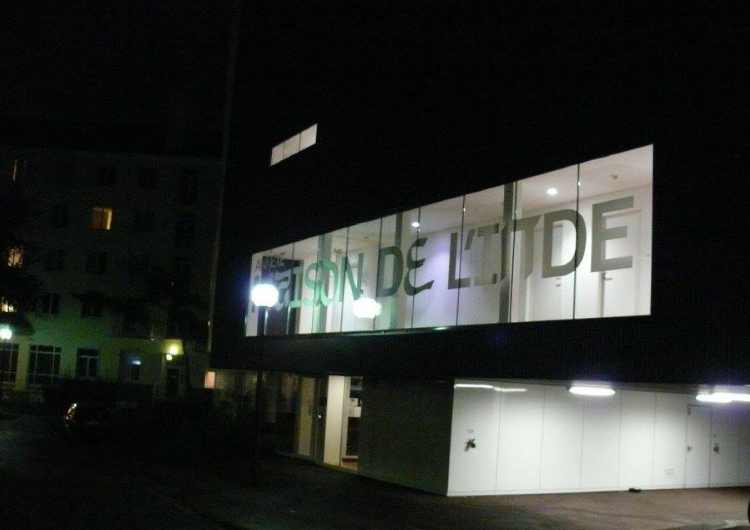
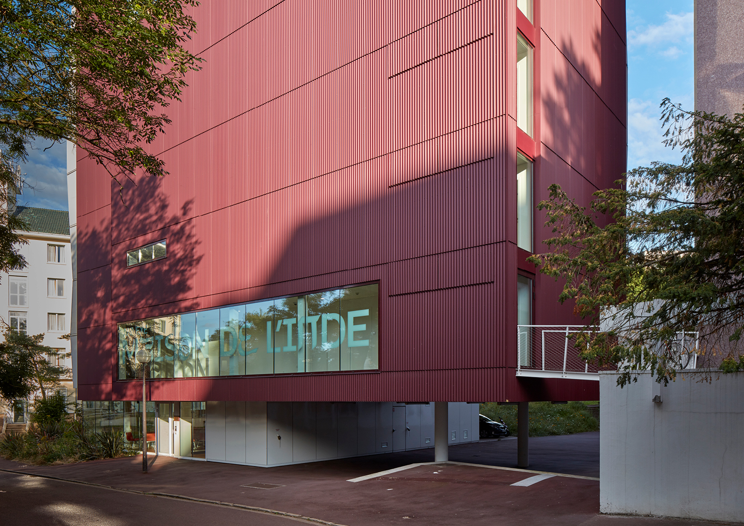
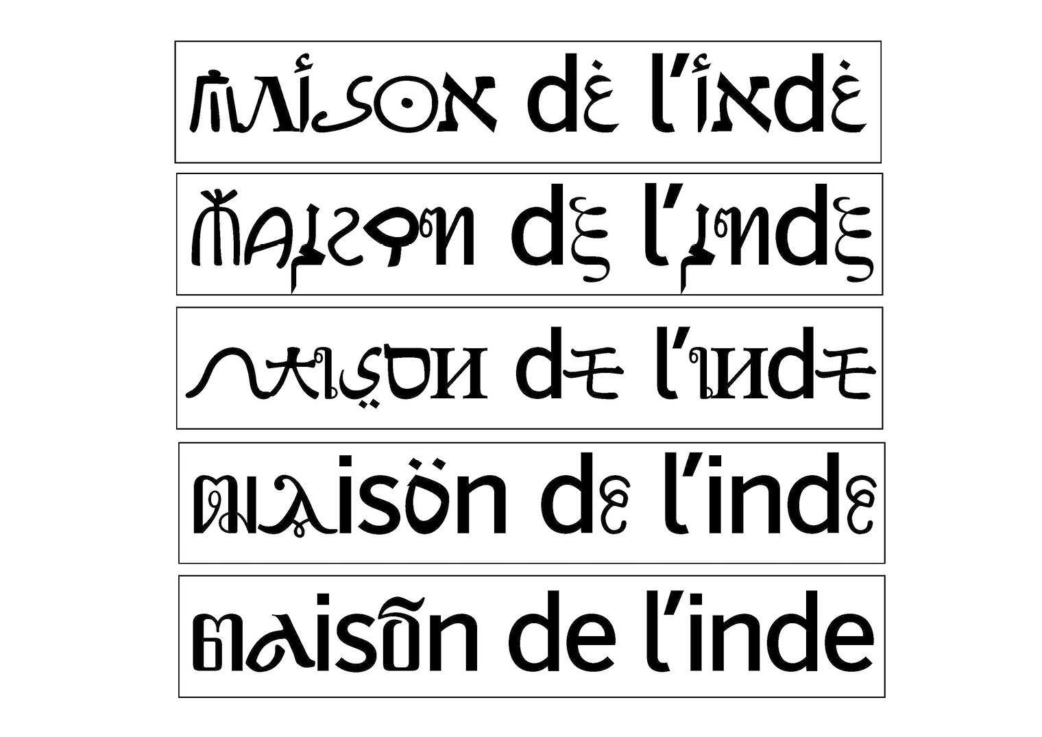
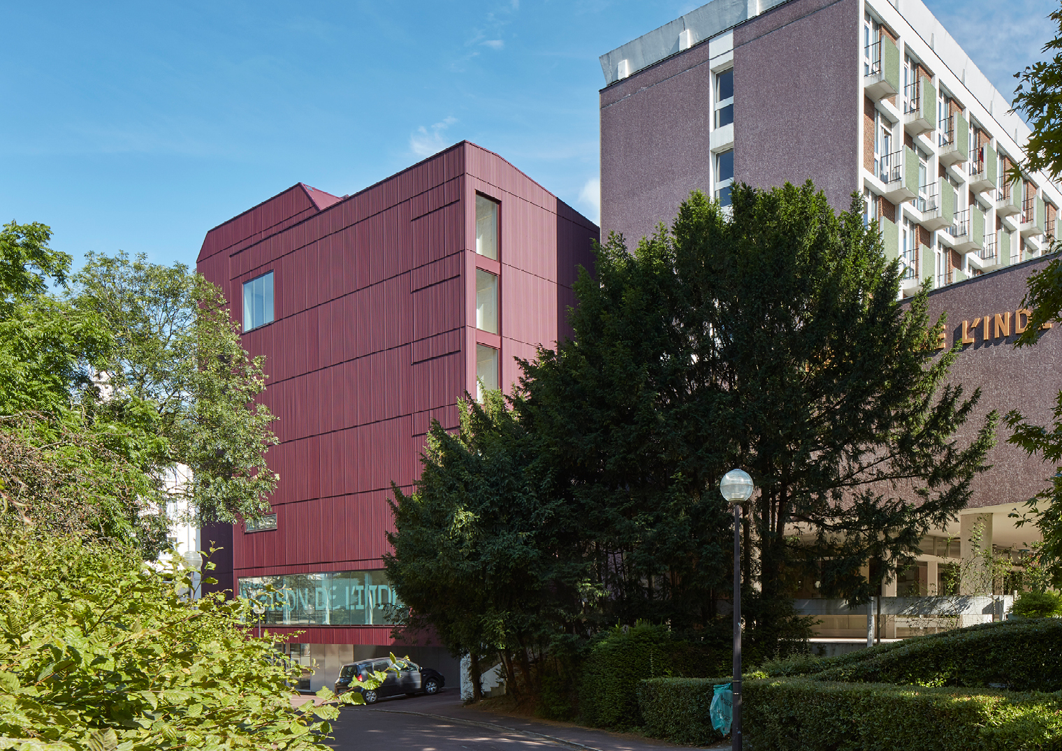
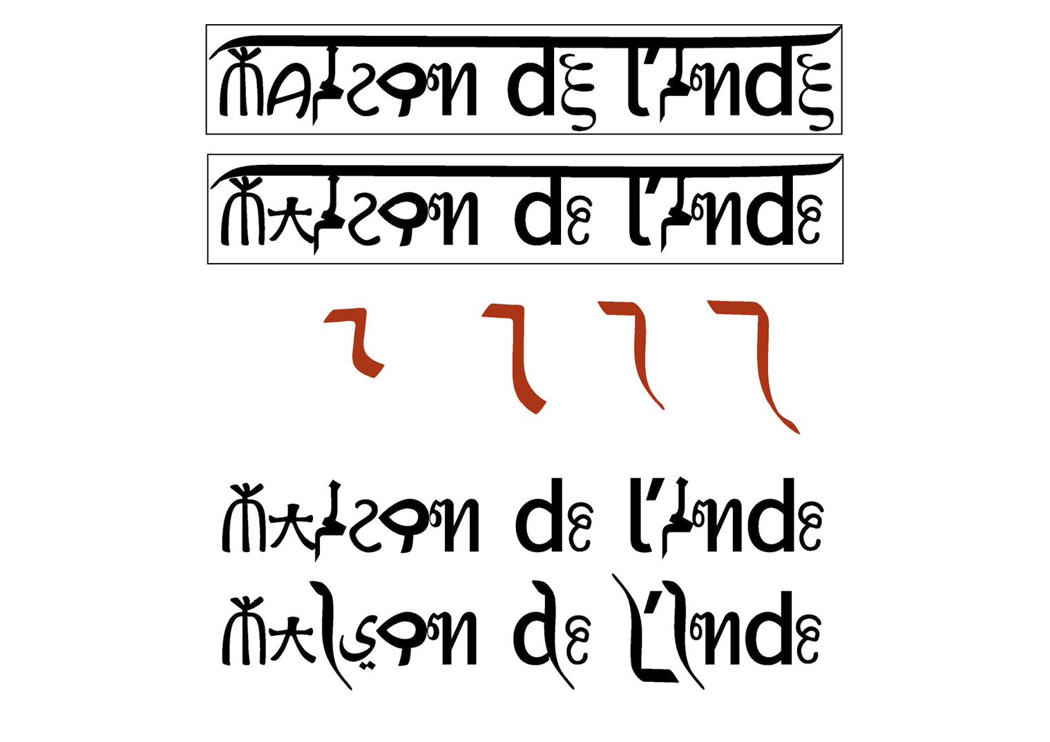
Entrance signage design for the Maison de l’Inde at Cité internationale universitaire de Paris (CIUP). The typographic design is based on the existing visual identity of the campus and the idea of combining Indian writing systems with Latin letters.
This visual identity is a combination of characters from different languages, creatively designed and harmoniously integrated with the Latin script. It aims to create a multilingual identity that feels cohesive and accessible to viewers in both linguistic contexts, bridging cultures and languages through its design.
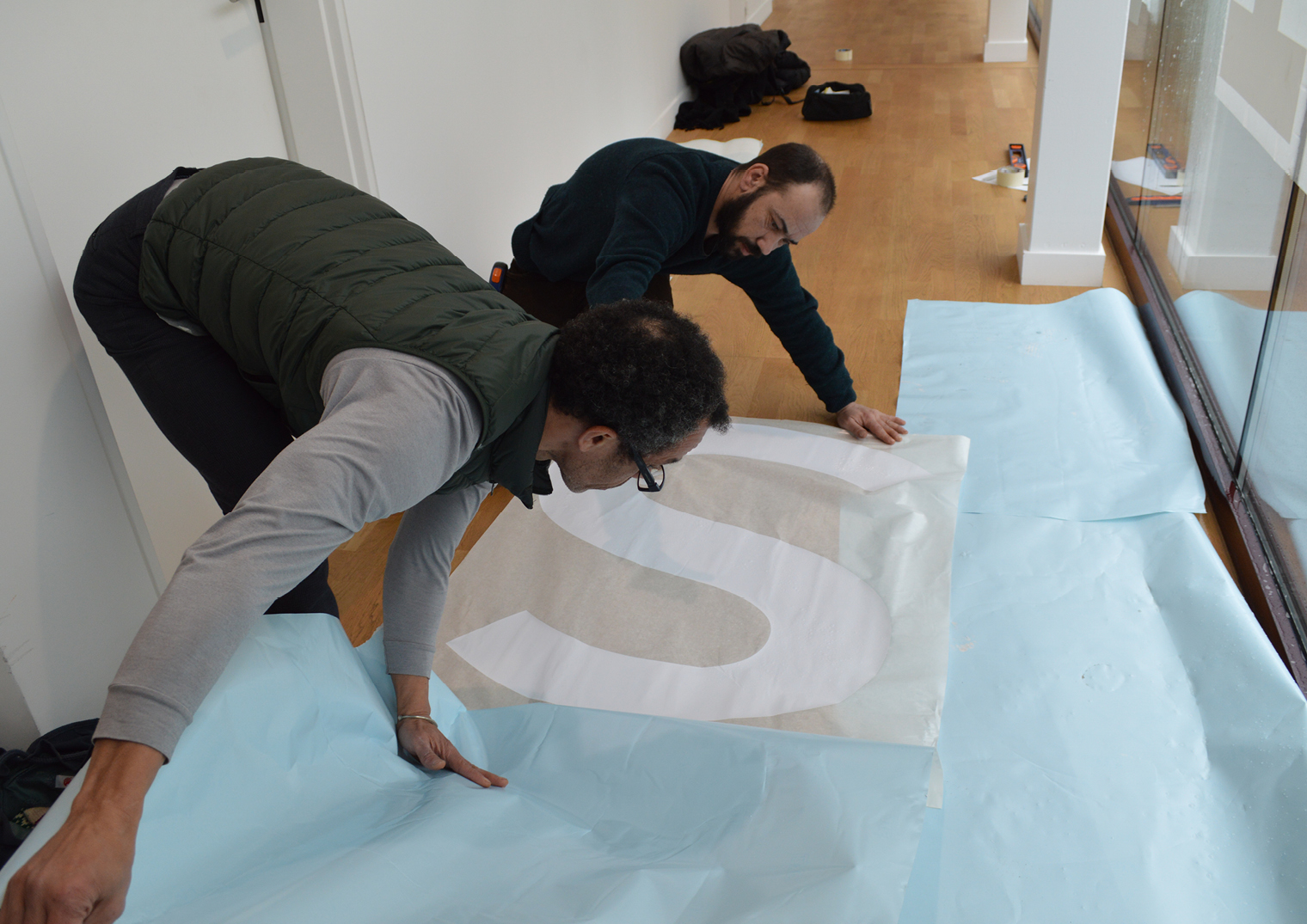
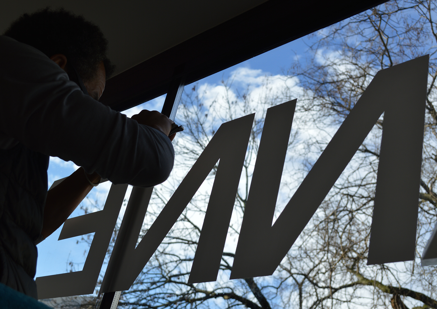
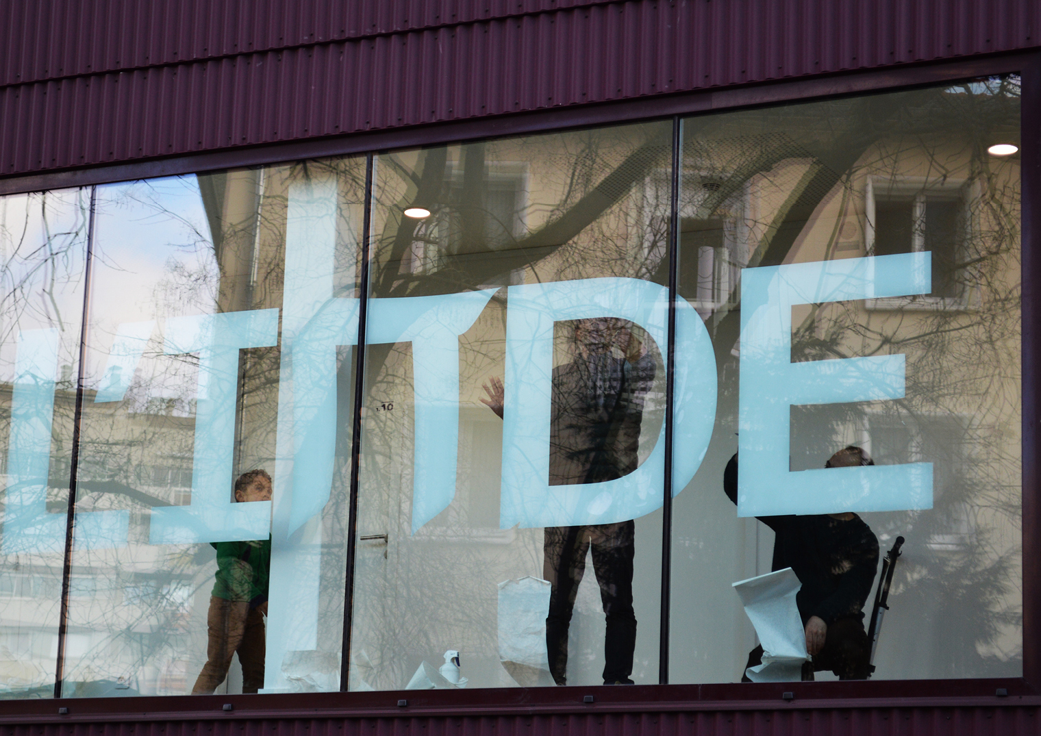
For the building’s signage, we decided to install white adhesive letters on the glass surfaces. This approach ensures harmony with the architecture and avoids visual disruption while maintaining legibility and significance. The result is a subtle yet effective solution that aligns with the multilingual identity of the project.